A room can contain attractive furniture, expensive lighting, and carefully chosen finishes while still feeling visually cold. The difference often comes down to surfaces that suggest texture, history, and the presence of the human hand. Oil painting prints can introduce those qualities without requiring the expense, maintenance, or collecting knowledge associated with original paintings. Their layered colors and painterly details interrupt the hard lines and uniform surfaces found in many contemporary interiors. That interruption can make a space feel less engineered and more personal. In practical decorating terms, the artwork becomes a counterweight to polished floors, smooth cabinetry, glass tables, and other elements that can otherwise make a room appear overly controlled.
Softness in interior design is not limited to cushions, rugs, curtains, or rounded furniture. Visual softness also comes from gradual color transitions, imperfect shapes, atmospheric backgrounds, and compositions that do not rely heavily on sharp geometry. Oil painting imagery naturally offers many of these characteristics because the medium has historically been used to create depth through blending, glazing, visible brushwork, and subtle tonal variation. Even when reproduced as a print, the image can preserve much of that visual complexity. A landscape with a hazy horizon, for example, can make a wall feel more open and less rigid. A loosely painted floral arrangement can soften an otherwise structured dining room without changing a single piece of furniture.
The artistic effect is equally important because rooms often benefit from objects that resist purely functional interpretation. A chair has an obvious purpose, as does a lamp, table, or cabinet, but artwork introduces ambiguity and invites observation. Oil painting prints can provide that pause because they often contain enough visual depth to reward repeated viewing. The viewer may first notice the dominant color, then the subject, then smaller details in the background or brushwork. This gradual discovery creates a different atmosphere from decorative objects that are understood immediately. The result is a room that feels considered rather than simply furnished.
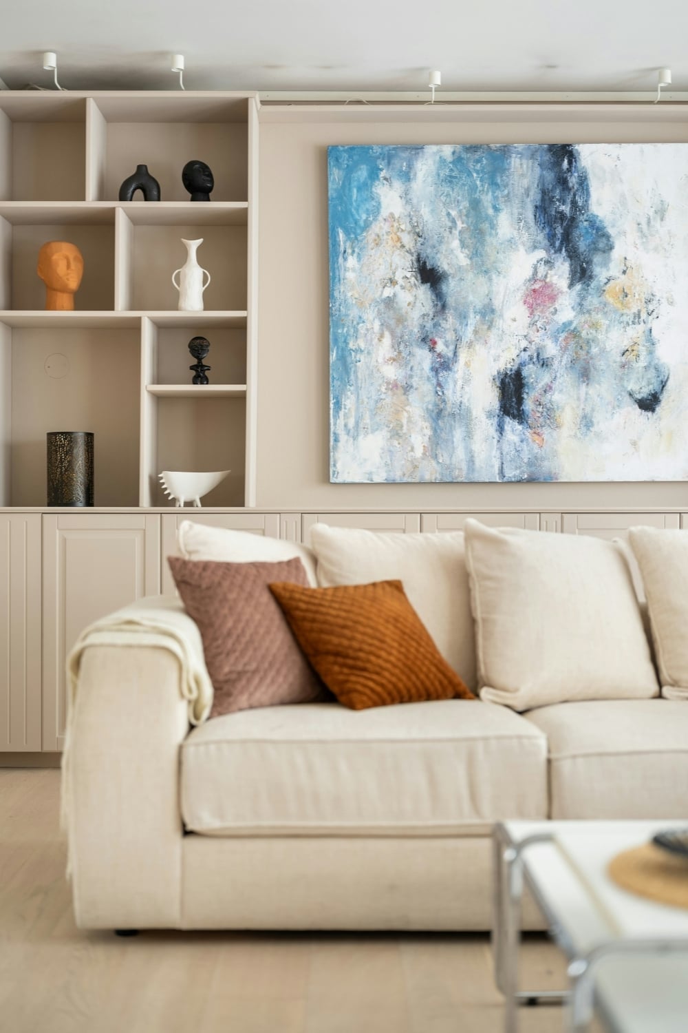
Image credit: Unsplash
Choosing Painterly Artwork That Supports The Interior
Selecting oil painting prints begins with understanding the existing visual structure of the room rather than choosing artwork in isolation. Wall color, furniture scale, flooring, natural light, and architectural details all influence how a painting will appear once installed. A richly colored landscape may look restrained against deep green walls but dramatically saturated against white plaster. Similarly, a quiet neutral still life can disappear in a beige room unless its tonal range offers enough contrast. The goal is not necessarily to match colors directly but to establish a relationship between the artwork and its surroundings. Strong rooms often contain repetition, contrast, and variation at the same time.
Once the room’s palette, scale, and overall mood are established, the next step is finding artwork that supports those choices without making the space feel overly coordinated. That can be difficult when selections are limited, especially if you want to compare different subjects, sizes, styles, and presentation formats before deciding. Broader online art marketplaces can make that process easier by giving homeowners more visual options to consider within the context of a specific room. A marketplace such as iCanvas brings together ready-to-hang artwork from independent artists, licensed estates, and cultural institutions in a range of materials and formats. For rooms that benefit from softer brushwork and painterly depth, exploring the varied styles available in its oil painting wall art collection can help narrow the search across landscapes, florals, portraits, and abstracts. The goal is not simply more choice, but finding art that complements the room’s color, mood, proportion, and character.
Subject matter should also be considered in relation to how the room is used. Bedrooms generally benefit from imagery that encourages visual calm, such as subdued landscapes, botanical compositions, soft abstractions, or portraits with restrained palettes. Living rooms can accommodate more complicated scenes because viewers usually encounter them from multiple angles and at different times of day. Dining rooms, entryways, and home offices can often support stronger color or more theatrical compositions because people spend less continuous time looking at the same wall. There are no absolute rules, but function can provide a useful filter when the number of appealing options becomes overwhelming. Good artwork does not merely fill an empty wall; it contributes to the behavior and mood of the room.
Using Color To Create Softness Without Making The Room Bland
Soft interiors are sometimes mistakenly interpreted as pale interiors, but softness and lightness are not the same thing. A painting dominated by burgundy, forest green, burnt orange, or deep blue can still create a gentle effect if the colors transition gradually and the composition has atmospheric depth. What matters is how tones relate to one another and how abruptly the eye encounters contrast. Oil painting prints often work well because many compositions contain a range of intermediate tones rather than a small number of flat, sharply divided colors. Those intermediate tones help visually connect unrelated furnishings. A painting that contains cream, brown, muted blue, and traces of green might quietly bridge a beige sofa, walnut table, blue chair, and collection of plants.
One of the most effective decorating strategies is to identify secondary colors within a print rather than focusing exclusively on its dominant hue. Suppose a large landscape is primarily green but includes small passages of ochre, faded pink, and charcoal. Those quieter colors can be repeated elsewhere through cushions, ceramics, lampshades, books, or a rug without making the room look overly coordinated. The repetition creates visual continuity while preserving the impression that the space developed naturally. Designers frequently rely on this type of restrained color echo because exact matching can feel artificial. A room usually becomes more convincing when colors appear related rather than identical.
Neutral rooms can particularly benefit from painterly color because the artwork provides movement without requiring permanent architectural changes. White, cream, taupe, gray, and natural wood create an adaptable foundation, but too much tonal consistency can leave a room feeling unfinished. A large oil painting print can introduce complexity while allowing the furniture and wall color to remain understated. The technique works because the artwork becomes an intentional concentration of color rather than one more competing element. If the print contains softened or weathered tones, even fairly strong colors can sit comfortably within a quiet interior. The room gains personality without losing its sense of calm.
Getting Scale And Placement Right
Scale has greater influence on the success of wall art than many homeowners realize. A beautiful print that is too small for its wall can appear tentative, while an oversized work in a cramped area can dominate everything around it. Above a sofa, console, bed, or sideboard, the artwork should generally have enough visual width to relate convincingly to the furniture below it. That does not mean following a mathematical rule without exception. It means treating the wall, furniture, and artwork as one composition rather than three unrelated objects. The strongest arrangement usually looks intentional from across the room, not merely attractive when viewed up close.
Height is another common source of decorating problems because artwork is frequently hung according to the height of the wall instead of the height of the viewer and surrounding furniture. When a print sits too high, it becomes visually detached from the objects below it and can make a seating area feel fragmented. Hanging it somewhat lower often creates a more intimate relationship between art and furniture. This is particularly important with oil painting prints because much of their appeal comes from the opportunity to observe details and tonal changes. Positioning a work closer to the natural line of sight encourages that engagement. Rooms also tend to feel more grounded when artwork belongs clearly to a furniture grouping rather than floating independently above it.
Large walls do not always require one enormous print, but they do require sufficient visual presence. Two or three related oil painting prints can occupy a broad surface while creating rhythm and allowing more flexibility than a single monumental piece. The key is to maintain a clear relationship among the works through subject, palette, style, or framing. Randomly assembling images simply because their dimensions fit the wall rarely produces the same coherence. Negative space between pieces should also be treated as part of the composition. Generous but controlled spacing gives painterly artwork room to breathe and prevents an arrangement from becoming visually noisy.
Pairing Oil Painting Prints With Modern Furniture
The contrast between traditional-looking artwork and contemporary furniture can be one of the most effective ways to make a room feel sophisticated rather than themed. A clean-lined sofa, minimalist coffee table, or sculptural modern chair becomes more interesting when placed near imagery that suggests brushwork, age, and artistic irregularity. The difference creates tension, and that tension prevents the interior from appearing as though everything was purchased from the same collection. Oil painting prints are particularly useful because they can introduce historical visual references without requiring antique furniture. A contemporary room gains warmth while remaining recognizably modern. The artwork functions as an expressive layer rather than a signal that the entire space must follow a traditional aesthetic.
This approach works best when some element connects the old and new visual languages. That connection might be color, proportion, material, or even subject matter. A modern cream sofa can pair beautifully with a moody classical landscape if the painting contains pale highlights that echo the upholstery. A black metal table may connect with the dark contours or shadows in a floral print. These small relationships give the contrast purpose and keep it from looking accidental. The room can contain objects from very different stylistic traditions as long as they appear to acknowledge one another.
Restraint becomes important when several highly expressive elements are present. If the painting has strong color, dramatic movement, and dense detail, surrounding furniture can often remain comparatively simple. Conversely, a room filled with patterned upholstery, sculptural accessories, or strong architectural finishes may benefit from a quieter painterly composition. Visual hierarchy gives the eye somewhere to rest and prevents every object from competing for attention. Oil painting prints should generally participate in that hierarchy rather than overwhelm it. Their greatest value often lies in giving modern interiors emotional depth, not in turning every wall into a gallery.
Building A More Layered Room Through Texture And Materials
Artwork is typically discussed in terms of image and color, but material relationships matter almost as much. Oil painting imagery naturally suggests texture, even when the physical surface of the print is relatively smooth. That implied texture can be reinforced by surrounding materials such as linen, wool, aged wood, woven baskets, stone, ceramic, and brushed metal. When several tactile elements appear together, the room begins to feel layered rather than flat. The effect is especially valuable in new construction, where walls, floors, and cabinetry may initially appear pristine and uniform. Painterly imagery helps introduce the visual equivalent of patina.
Natural materials tend to pair particularly well with oil painting prints because both contain variation. Wood grain shifts across a tabletop, linen shows small irregularities, stone contains veining, and painterly images display changes in tone and mark making. Those variations prevent a room from feeling overly manufactured. A still life beside a rough oak console, for example, can feel richer than the same image above a glossy synthetic cabinet because the materials reinforce one another’s visual character. Likewise, landscape imagery often works naturally with wool rugs, leather seating, and earthy ceramics. The relationship does not need to be literal to feel coherent.
Texture can also be introduced through framing and presentation. A simple wood frame can warm a cool-toned print, while a dark narrow frame can add structure to a loose, atmospheric composition. Canvas presentations can emphasize the connection to traditional painting, while paper-based formats may create a lighter, more graphic effect. The choice should depend on the architecture and furnishings rather than assumptions about what kind of frame belongs with a particular artistic style. In some cases, an ornate frame can create an appealing counterpoint to minimalist furniture. In others, the same frame would add unnecessary visual weight.
Using Lighting To Make Painterly Art Feel More Atmospheric
Light determines how color is perceived, which means it also determines how successful an oil painting print will look in a particular room. Natural daylight can reveal subtle distinctions among muted colors that become less visible under artificial illumination. Morning light may make warm pigments appear delicate, while late-afternoon light can intensify ochres, reds, and browns. Before selecting artwork, it is useful to observe the wall at several points throughout the day. A location that seems bright at noon might become surprisingly dim after sunset. Understanding those changes helps prevent a print from looking vibrant online or in a store but dull once installed.
Artificial lighting should support the artwork without creating theatrical glare. Picture lights, directional ceiling fixtures, and carefully positioned lamps can all give wall art greater presence in the evening. Warm light often complements traditional landscapes, portraits, botanical imagery, and still lifes because it emphasizes their earthy pigments. Cooler light may work better with blue, gray, or contemporary abstract compositions, although the surrounding room still needs to be considered. Excessively bright illumination can flatten subtle tonal differences and make a soft composition feel harsher than intended. The best lighting allows viewers to notice details while preserving the atmosphere of the piece.
Shadow can be useful as well because a softly lit room does not need every surface to receive equal illumination. Oil painting prints often become more evocative when surrounded by pools of light and areas of relative darkness. A table lamp positioned beneath or beside a print can create enough local illumination to draw attention to it without turning the wall into a display case. This strategy is especially effective in bedrooms, libraries, and living rooms where mood matters more than uniform brightness. Art then participates in the evening atmosphere rather than simply remaining visible. The room feels softer because illumination becomes layered in much the same way as furniture, textiles, and color.
Creating An Artistic Room Without Making It Feel Overdecorated
An artistic room is not necessarily one filled with the largest possible number of artworks. In fact, too many visually assertive pieces can weaken one another by eliminating hierarchy. Oil painting prints often contain significant detail, color variation, and compositional movement, so they benefit from enough surrounding space to register clearly. A single strong work on an otherwise quiet wall may have greater impact than a dense arrangement of unrelated images. The principle is similar to editing a written argument: emphasis becomes stronger when not every sentence is trying to deliver the main point. Decorating benefits from selective intensity.
The same discipline should be applied to accessories. When a room already contains expressive artwork, every shelf does not also need sculptures, framed photographs, candles, decorative boxes, plants, and collections competing for attention. A few carefully chosen objects can reinforce the mood of the painting without repeating its subject literally. A ceramic vessel beneath a floral print can create a material connection without requiring fresh flowers or botanical motifs everywhere else. A stack of art books near a landscape can suggest an intellectual relationship without becoming a decorative theme. The objective is cohesion rather than repetition.
Editing also helps preserve softness because visual clutter creates a form of tension. Painterly artwork works particularly well when the viewer has enough visual quiet to appreciate its subtle transitions and details. Leaving portions of a wall empty can therefore be an active design decision rather than evidence that a room is incomplete. The same is true of open space on tables, consoles, and shelves. A softer room often depends as much on what has been withheld as on what has been added. Oil painting prints can provide substantial character precisely because they reduce the need for numerous smaller decorative gestures.
Letting The Artwork Shape A Room Over Time
Some of the most convincing interiors are assembled gradually rather than completed in a single purchasing cycle. Artwork is particularly well suited to this slower approach because people’s visual preferences often become clearer after they have lived with a space. An oil painting print selected for a living room may eventually influence the choice of a new rug, lamp, side chair, or curtain fabric. Instead of treating those connections as evidence that everything should have been planned in advance, they can be viewed as part of the room’s evolution. Homes often become more personal when one meaningful choice informs the next. The resulting interior tends to feel collected rather than manufactured.
Living with artwork also changes the way it is perceived. A print that initially attracts attention because of its dominant color may later become interesting because of a minor figure, distant building, flower, or patch of light that was not immediately noticed. That developing familiarity is one reason painterly images work well in residential settings. They can contain enough complexity to avoid becoming mere background decoration after a few weeks. The strongest pieces continue to participate in the room even after their initial novelty has faded. They become part of the home’s visual memory.
Ultimately, decorating with oil painting prints is less about reproducing the atmosphere of a museum or traditional gallery than about introducing visual humanity into everyday space. Their appeal lies in their ability to soften sharp architecture, connect disparate colors, balance modern furniture, and bring a sense of artistic depth to walls that might otherwise feel anonymous. Careful choices about scale, palette, lighting, materials, and placement allow that effect to remain subtle rather than theatrical. The room does not need to announce that it is artistic. It only needs to feel more layered, considered, and emotionally comfortable because art is present. When that balance is achieved, the paintings do more than decorate the walls; they change how the entire room is experienced.
Thanks for stopping by!
Magda
xoxo
<3